Sunday, 9 January 2011

Come little rabbit!

Doing some sketches of rabbits has inspired me to try and illustrate a bunny/rabbit related song/poem, I remembered a song my children used to love while at nursery called 'Come little rabbit' its a really sweet little song with hand actions, i am planning to continue throughout this week practicing sketching rabbits and certain elements within the song which i then plan to develop and experiment with to try and develop into a style i can apply to future illustrative projects.


'COME LITTLE RABBIT'

In a cottage in the woods,
A little old man by the window stood,
He saw a rabbit hopping by,
frightened as can be

"help me, help me, sir" she said
"before the hunter shoots me dead"
come little rabbit, come with me
stay safely at my side

Friday, 7 January 2011

Rabbits

Sat here with not much to do i had the urge to draw, The first thing that came to mind was 'rabbits' so thats what i have done and i've quite enjoyed it so i will continue to do more illustrative sketches and maybe turn them into something in the end, Valentine love bunnies maybe!! or they could feature on a children's book cover or feature as illustrations within a children's story.


Out with the old

This is a link which will take you to my other blog which has a lot of the experimental phases from my final pieces


http://emmathompson09.blogspot.com/


I am also working on a blog which will feature all my research and ideas for my forthcoming wedding plus a family blog which is a light hearted insight into the "madhouse" i will update with links when they are ready to go.

Thursday, 6 January 2011

Words

I started this project early last year but the end result was so bad urggh! I have decided to go back to it now i can do it for myself and not to be answering a certain brief or created to what a tutor recommends! In the early stages i had an idea to create something based on words which according to the internet are the top 100 words to know to impress an examiner in A level and above, I had an initial idea to create a set of a type of flash card aimed at higher education students which would be something typographic and visually appealing, the images i have uploaded are the first stage of trying to create such a thing, I have now had ideas to try and create a small book which could maybe incorporate the flash cards within it?! so here goes, the first project of 2011.


A new start

I wanted to show you a few pieces which i feel turned out quite well while i was working towards my degree last year, I still feel quite under confident within work i produce and need to continue experimenting with new concepts and briefs to improve on the skills i have, I would love to now start finding my own style that i feel represents me in the right way, I would like to be able to combine different ways in which i work combining illustrative experimental pieces with a more graphic approach, I am contemplating a future within teaching and have applied for a place on a Art related PGCE but while i do have a passion for teaching and working with high school students i would like to continue and even attempt to make some kind of career out of work i produce, maybe in a freelance role. Who knows what the future will hold for me but I'm sure it will be an interesting and fulfilling year ahead, I have two placements within high schools coming up and i am still involved with the ideas foundation, Heres to a great 2011!

Greater Manchester Police

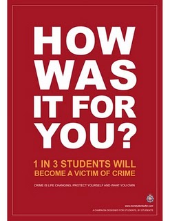
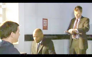
One of the biggest achievements so far while i have been in design was to be chosen from many entrants along with Helen Butterworth & Isobel Stockhill to design the new Student Safety Campaign in manchester which would be featured in magazines, papers, universities across Manchester and along Oxford road as banners. Our concept was to create a visually informative poster which put across how important it was to be safe while attending universities but in a way which didn't come across as patronizing and dull, We came up with four slogans which we felt would draw students in without them at first relating it to the police, this information would make itself apparent after you had already taken in the information we had to get across, our slogans were different quotes which we related to either the criminals point of view or the victims. It has been highly successful and has received a lot of publicity good and some a little negative but all publicity is good publicity were a new campaign is concerned! Our posters have also featured on coronation street in the police cells!


We also received a letter of thank-you from the chief of police which was presented to us by the mayor of Manchester.


Ian Anderson

One of the highlights for me during my time at university was to have the opportunity to attend workshops with Ian Anderson (tDR), To obtain a place on these workshops we had to answer a brief from Ian which was to send him something he would want to keep forever, I came up with the idea to send him money as nobody wants to throw that away but i had to come up with an idea to create something which didn't look like a bribe, and also something which made him want to keep it and not just spend it, i opted in the end to create an origami lucky star using a five pound note hoping this would work as i intended, It did and i secured a place in his workshop, I don't know if he has kept the star or unfolded it to buy a coffee :D but it was the best fiver i have spent so far, and at the end of the workshops we all received a signed copy of his book 3D>2D which i treasure.


Simply Shoes

These T'shirts were designed out of my love for shoes and also probably every other girl/ladies love for them to, I wanted these designs to appeal to young ladies aged  13+, as a result of the images produced i made cards which i now sell, i have also sold a few T'shirts to the younger target audience, i also took my daughter out to take few photographs of her wearing the most popular design, I had lots of fun creating these pieces.


Silence

Our brief was to create visuals which related to silence in order to create a folded piece as the final element, After researching different ways in which Silence could be represented (there was certainly plenty to choose from)i chose to base my experiments on the silence which surrounds death, morbid i know but certain elements surround death can be quite comforting and peaceful, I generated lots of visuals from this but the more i delved into this subject i felt i wanted to produce something which represented a comfort within the subject which surrounded my self and my family, I looked at old photographs which contained images of relatives which i loved dearly and are unfortunately no longer with us, i represented this by scanning in photographs keeping the majority of them colour and turning the deceased family member B&W keeping them in the picture as we do in our memories they may fade but they never leave us so taking the image away completely didn't seem appropriate, Not wanting to create a book which i thought would have been the safest option as a folded piece i wanted to create something more unusual, something which created the sense that these photographs are always a comfort and it helps you be at peace reliving the memories associated with each one, it was a while before i had the idea to create a patchwork quilt which folded away to be stored as a patchwork quilt would be,to keep stored to pass down through generations keeping memories alive,To be something which is comforting,To represent how fragile life can be i printed each photograph on paper napkins which i then stitched together using white cotton to represent the idea of a silent blood line which holds the family unit together, I love this piece and it was nice to be able to work in a different way.


Jane Austen

Wanting to keep the collection quite graphic and yet still contain elements of the characters and story was were i decided to begin when trying to create designs for  this collection of Jane Austen book covers, As it is a collection i felt the designs needed to relate to each other using the same approach within each title, After experimenting i decided to choose these as my final pieces, I chose colours which represented the main characters personalities and combined this with a design which i felt depicted the story while also keeping a female element,building the visuals out of circles which i felt was a way of representing female characteristics.


Chekhov

The brief given was to create visual pieces to reflect the contents of a short story by Anton Chekhov, After reading through a few of them i decided upon DREAMS, The illustrations which were produced are the result's of experimenting with details through the story which depicts the journey of a man being escorted out of town down a dirt cobbled path surround by mist, fog and wildlife, As i absolutely loved all the experimenting within this project i decided to take the brief a step further to create a collection of Book covers.


H G Wells

These book covers were designed based on the idea of keeping the books as a set each representing the same elements from the individual title. I wanted the final covers to be visually appealing and work together as a collection. I found generating bar graphs using the amount of pages in each chapter produced some strong graphics which enticed people to want to pick up the book as they found the visual aspect intriguing.